


French Country Style: An interview with Sara Silm of Chateau Montfort
If, like us, you are a fan of French interiors then you may have been stopped in your tracks by the ...

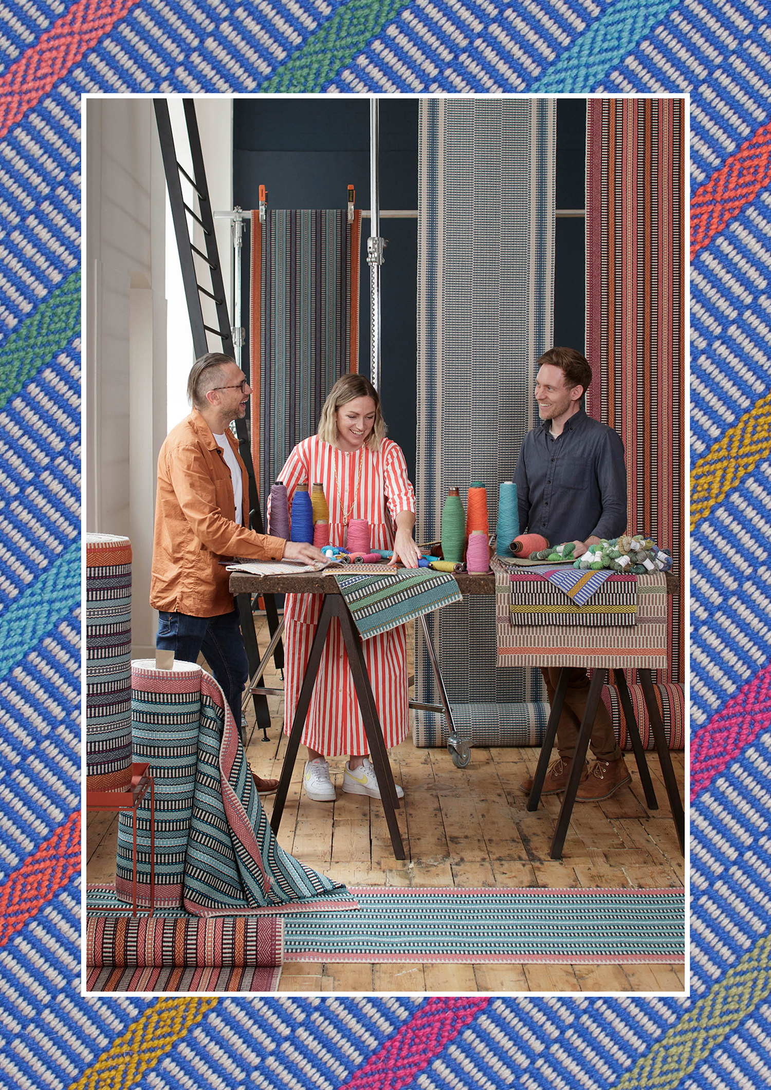
Our new collaboration ‘A Journey in Colour’ is certainly one of our most exciting and experimental collections to date. An adventure full of colour, energy and geometry. We discuss the story of this collaboration with our Creative Director, Andy Guard and pattern masters and creators behind A Rum Fellow, Caroline Lindsell and Dylan O’Shea.
Tell us the story behind this collaboration. How did it come about?
Caroline & Dylan: We first met soon after launching back in 2014. From there a friendship and mutual appreciation grew for each other and what we do. When Andy told us about the development of the diamond weave, and the goal to introduce more pattern, it was the spark that ignited those first conversations of bringing our familiarity of geometric pattern together with this new venture. The whole idea of collaborating was organic and unforced, much like A Rum Fellow and Roger Oates’ approach to design!
Andy: I was aware of Caroline and Dylan and the early work they had done with those fantastically patterned cushions. When we first met we very quickly discovered a mutual appreciation and passion for the importance of colour, balance and pattern. I always had it in my mind I needed to find a way to work with them. At our first meetings we spent time learning more about each other and wondering how we could make two companies with such independent colour identities combine.
What is your main inspiration behind this collection?
Andy: The initial inspiration was imagining a meeting of the dynamic pattern and tones found in A Rum Fellow’s collections, and to find a coherent way of integrating this with the signature of Roger Oates Design, which has been dedicated to exploring colour and pattern for over 30 years. We started this project in 2019, so the reality of the development was the back drop of the pandemic, of being unable to travel and explore. Our focus quickly became the very idea of travel, of looking ahead to future adventures, we called it ‘colour escapism’. A way to bring joy, energy and colour into the home through imagined paradises and faraway lands. The final collection in some ways is simply a reflection of the parts of our identity that clicked together perfectly, with an unpredictable explosion of pattern and colour.
There is a real versatility to the collection and this is a testament to the work that has gone into the layering of pattern and placement of every colour, design that will be celebrated for generations to come.
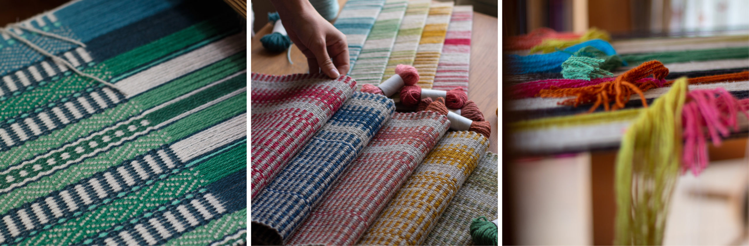
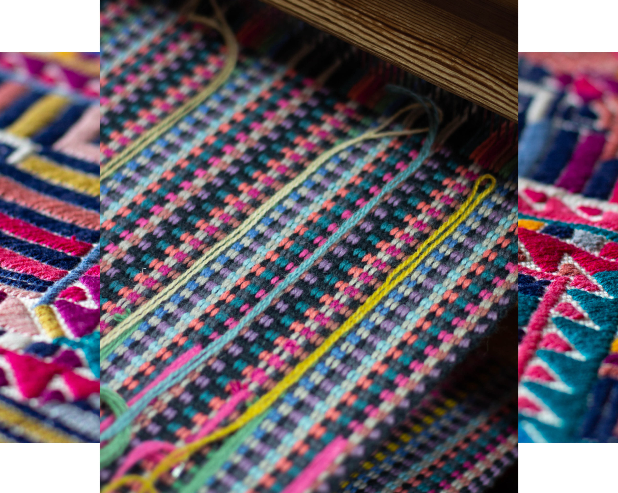
Caroline & Dylan: Our way of approaching any design is creating something that has an unpredictability – and that is reflected in our name. ‘Rum’ is about the peculiar and unexpected and we translate that into our design by pushing ourselves creatively and allowing the inspiration to evolve with the process. Starting with the introduction of the diamond was the perfect place to begin the evolution of the story – and introducing colour brought an energy which is seen throughout the whole collection.
Is there a particular design that has a special meaning to you?
Caroline & Dylan: Morella! It was the first design we started working on as a team and showcases the diamond as a symbol of the collaboration and encompasses the whole collection. I (Caroline) love the Coral – and that unexpected pop of lilac which was something Andy put in based on something we had previously done. For me (Dylan) Neptune and Atoll are a great balance of dialled up, happy colours. They would make anyone smile when they walked into a hallway!
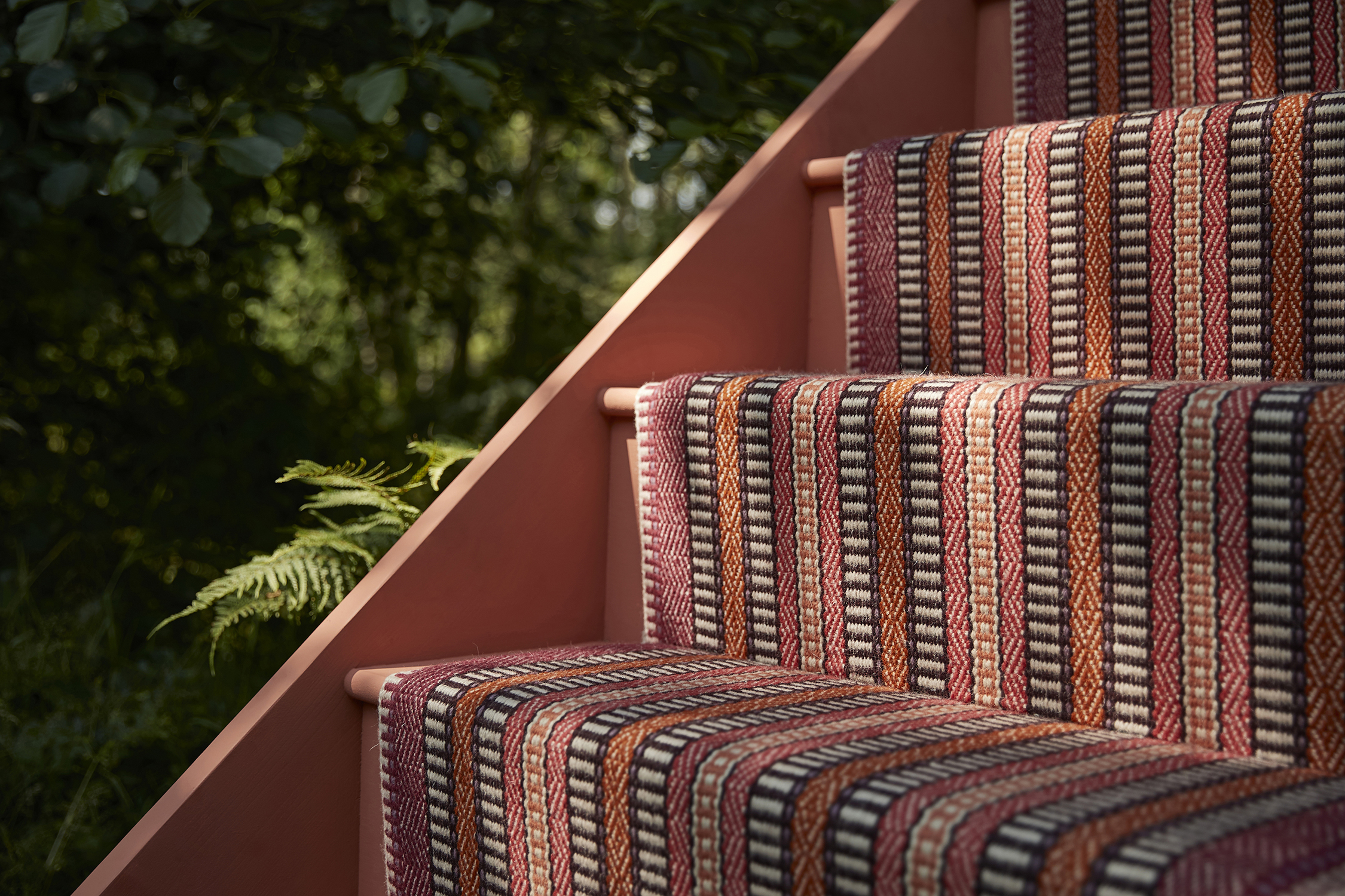
Andy: They all do! Kahlo has a particularly special meaning to me as in the early stages unknown to one another, Caroline and I both developed this design independently. It’s also the first design we started, and the last one we finished; the time we had to work and evolve it helped us naturally bring the whole collection together. Kahlo is a non-symmetrical, non-repeating, vividly coloured stripe over a geometric pattern – it’s a fitting celebration of the new technical process that gives us the distinctive stripes of diamonds. It has everything that I think a new Roger Oates flatweave should, but with A Rum Fellow running though its core – it’s become so much more than I ever imagined it could be.
Describe the importance of colour in this collection?
Andy: There are no ‘so called’ neutral designs in ‘A Journey of Colour’. We wanted to put in so much colour there was simply no room for them! It was really important that we created a diversity of colour intensity, and this is revealed in how the tones are introduced into each design. The subtle tonal palettes of Mila give way to the more vivid colour seen in Kahlo and Morella. These strong new colours are used in Arta too, joining the collection together.
ARF: The most important thing was the fusion of two companies with a strong colour sensibility and how to bring that together. How we mixed both palettes to find a balance of strong colours and then choosing where that colour was placed!
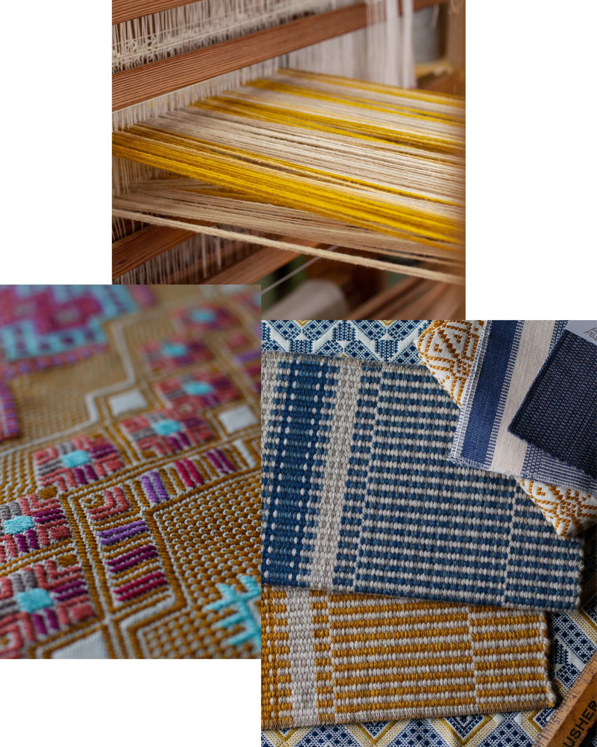
The collaboration included developing a diamond weave structure. Elaborate on the ‘the diamond’ as a symbol of the collection?
Andy: The diamond is at the heart of this collection. It brought a new structure to Roger Oates Design, but importantly it gave us a whole new area to explore together and to take a few cues from A Rum Fellow’s passion for geometric shapes. We developed ‘Morella’ to allow the diamond to take centre stage in this bold design, and it all works so well because it has this extra edge.
Caroline & Dylan: Geometric pattern is a historic form of design that has been around for millennia and is an important part of what we do. The Diamond goes hand-in-hand when working with weave, and being part of the Diamond in ROD evolution has been something very special for us to be part of.
How would you use this kind of colour in your home?
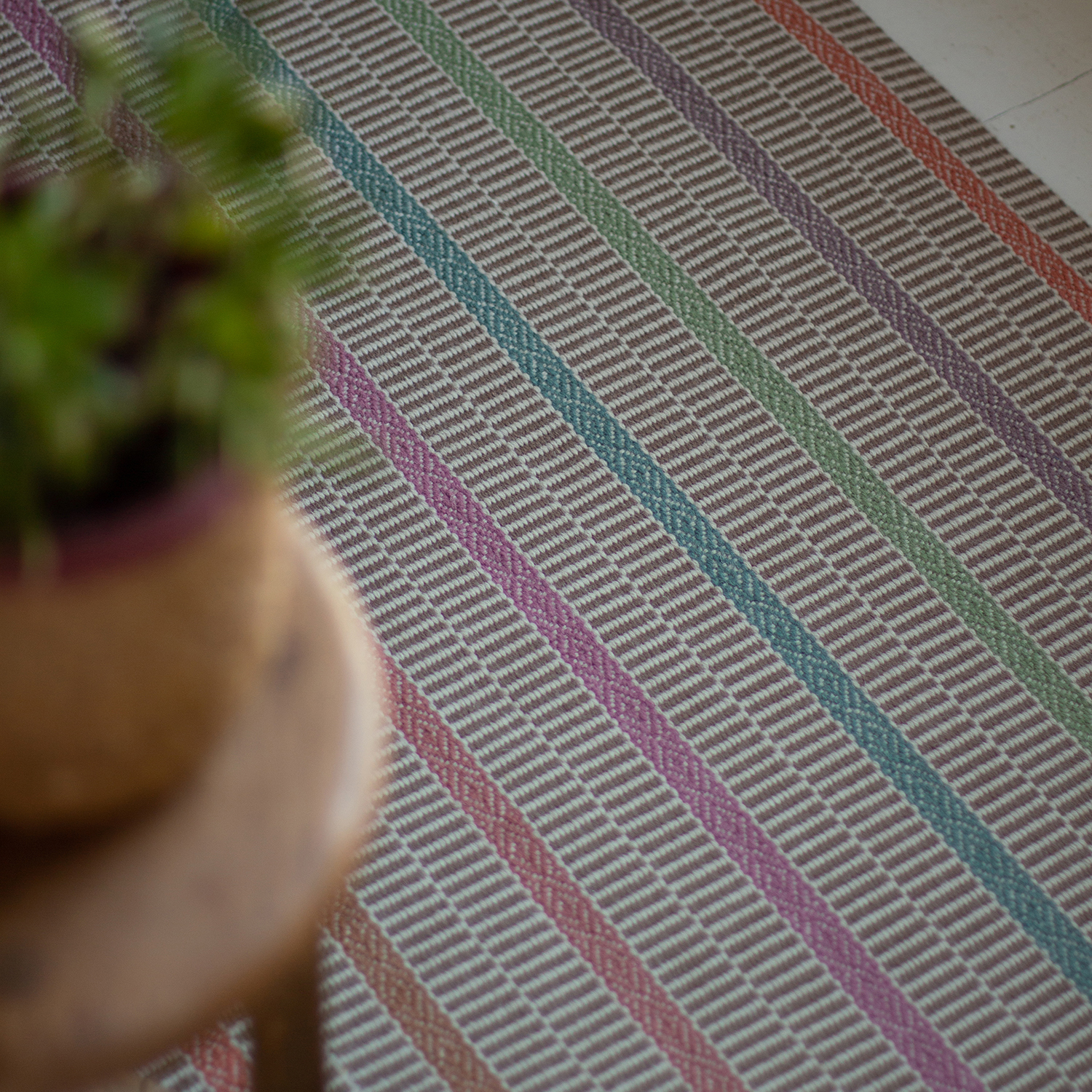
Andy: The large repeat of Kahlo is spectacular when seamed into a rug. Go bold and striking – choose Kahlo Majorelle with its brilliant blue, inspired by the famous Moroccan gardens. This will become a centrepiece in any room, how could it not? Alternatively, the paired back structure and soft tonal palette of Mila is ideal for injecting subtle colour and pattern into schemes. As a rug the stripes transform the feel of the design from how it appears on stairs, the soft colour is uplifting without overpowering its surroundings.
Caroline & Dylan: Definitely the hallway! Hallways are areas you can be bold – with less going on it’s a space to really inject colour and pattern, a starting point for the colour story you use in that space. It also makes the transition between spaces something that is fun, where every step makes you smile.
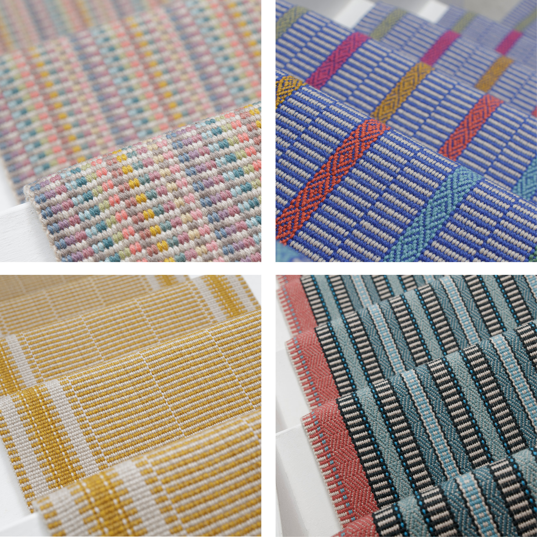
Top left Arta Opal and top right Kahlo Majorelle. Bottom left Mila Gold and right, Morella Atoll.
A Journey in Colour sees four new designs introduce ten specially selected colours to our heritage palette. Find the full collection here, then share your favourite with us on Instagram, Facebook or Twitter.
Wherever you are in the world, find your local Roger Oates Stockist or Distributor.
Please enter your details below to receive a copy of one of our full-colour brochures (UK only)
We offer custom colours, shapes and sizes, as well as bespoke design options in both Venetian flatweave and Hand Tufted rugs.
